| Author |
Message |
|
Rupikachu
King
Joined: Mon Oct 19, 2009 4:27 pm
Posts: 389

|
 Feedback plz? :3
_________________
Note that i'm Raven, your old and almost invisible admin, using Rupikachu just to avoid confusions with the 2-3 Ravens that play on the server.
|
| Tue Aug 03, 2010 7:15 am |

|
|
|
No One
Nobody did what? T.T
Joined: Thu Jan 07, 2010 2:56 pm
Posts: 837
Location: Test subject disposal area
|
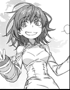
Re: Feedback plz? :3 First off, the concept is pretty cool. I've not ever been good at drawing human figures, but here are a few things that I have noticed:
- The hat appears to move as the character runs, although the head appears to remain still. Either keeping the hat the same or having more bob to the head may improve the flow of the actual animation.
- The way the character is leaning makes it feel as if it is running downwards slightly - I do not know if that is intentional or not. It doesn't detract anything from the drawing, but if you intend to add a background to the piece, it's something to keep in mind.
- The hair doesn't appear as if it is being affected by wind as the figure is running. Making the hair flow as if it was affected by wind could be a reason I found the flow of the head off.
Hope this helps!
_________________

|
| Tue Aug 03, 2010 9:41 am |
|
|
|
RikaPSO
Global moderator
Joined: Wed Oct 14, 2009 8:20 pm
Posts: 774
Location: NY
|
Re: Feedback plz? :3 Really cool Raven. ^^
|
| Tue Aug 03, 2010 11:58 am |
|
|
|
Rupikachu
King
Joined: Mon Oct 19, 2009 4:27 pm
Posts: 389
|
Re: Feedback plz? :3 Yeah hair is quite solid, although i made some parts move it ended looking weird, i guess i should remake the entire hair animation, also the size (final versions will probably go at 1280x720 and downscale for phone) make it less visible....i'll give it a run if it looks bad i can revert it back. Also thanks! Moar! 
_________________
Note that i'm Raven, your old and almost invisible admin, using Rupikachu just to avoid confusions with the 2-3 Ravens that play on the server.
|
| Tue Aug 03, 2010 12:21 pm |
|
|
|
Karma
PROSPECTORS!
Joined: Tue Oct 06, 2009 10:21 pm
Posts: 2416
Location: Dragon cave
|
Re: Feedback plz? :3 In the first picture you posted it looks like something's in her eye. XD
Other than that, character design itself looks great.
I agree with No one in saying that the running animation doesn't quite feel right. Not sure if it's the head or the torso that's doing it for me, though.
|
| Tue Aug 03, 2010 4:48 pm |
|
|
|
Blu
Champion
Joined: Tue Nov 03, 2009 7:37 pm
Posts: 182
Location: Canada
|
Re: Feedback plz? :3 Yea personally I think you should move the head a bit backward but not too much, other than that, it looks awesome!
|
| Tue Aug 03, 2010 5:35 pm |
|
|
|
Rupikachu
King
Joined: Mon Oct 19, 2009 4:27 pm
Posts: 389
|
Re: Feedback plz? :3 Actually no eye made on that one (last one does though). You mean the entire head like the second or third here?  Sorry for the white xD  This one was a bit more recent (yesterday or so), the back (growing line) was fixed, and well turbo mode! (except on safari wtf) yet no changes from today ( i was adoing the colour tests) will try to make some changes tomorrow or thursday. Also i think the big size makes the flaws more easy to see
_________________
Note that i'm Raven, your old and almost invisible admin, using Rupikachu just to avoid confusions with the 2-3 Ravens that play on the server.
|
| Tue Aug 03, 2010 6:35 pm |
|
|
|
Sin
God
Joined: Sun Dec 06, 2009 1:45 pm
Posts: 956
Location: California
|
Re: Feedback plz? :3 Lookin good raven.
_________________

Sin: HUmar | Ymir: HUcast | Rinzece: HUnewearl | Kanon: RAmarl
"power level = 2^ (#of frills / ruffle layers *0.75)"
|
| Thu Aug 05, 2010 3:34 pm |
|
|